The Dixons Effect – Kin Research
The installation
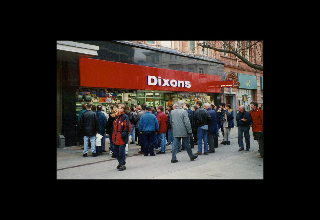
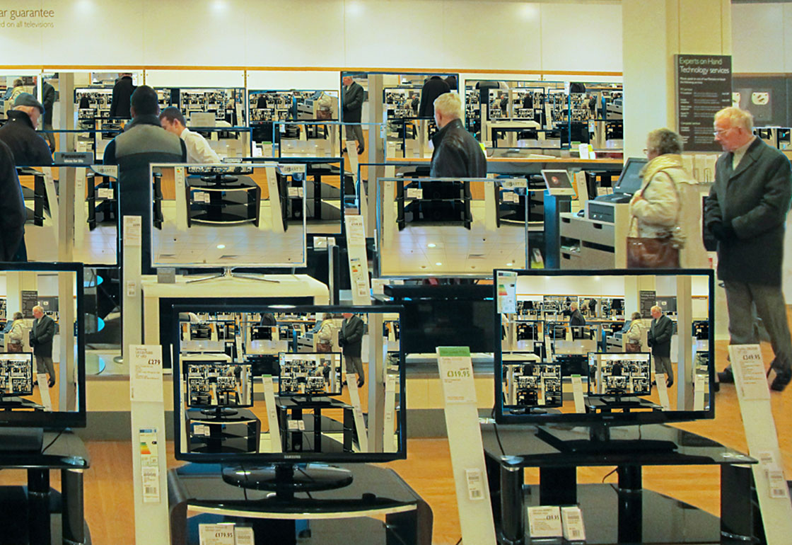
Its the late 80s you’re walking along the high street, past Woolworths and Blockbusters. Out of the corner of your eye some movement draws you to look at the display of TV screens in the electronics shop. Nestled amongst the latest television set is a single camcorder looking out of the window, giving a live feed of whoever is walking past on each of the twenty or so tellys piled up for sale. Passersby become participants as they make gestures, silly faces or just move across the frame and watch themselves play back in real time. The way this arrangement of simple technology draws people in, and sets out a space for playful interaction is what we’ve termed The Dixon’s Effect.
Why it's useful
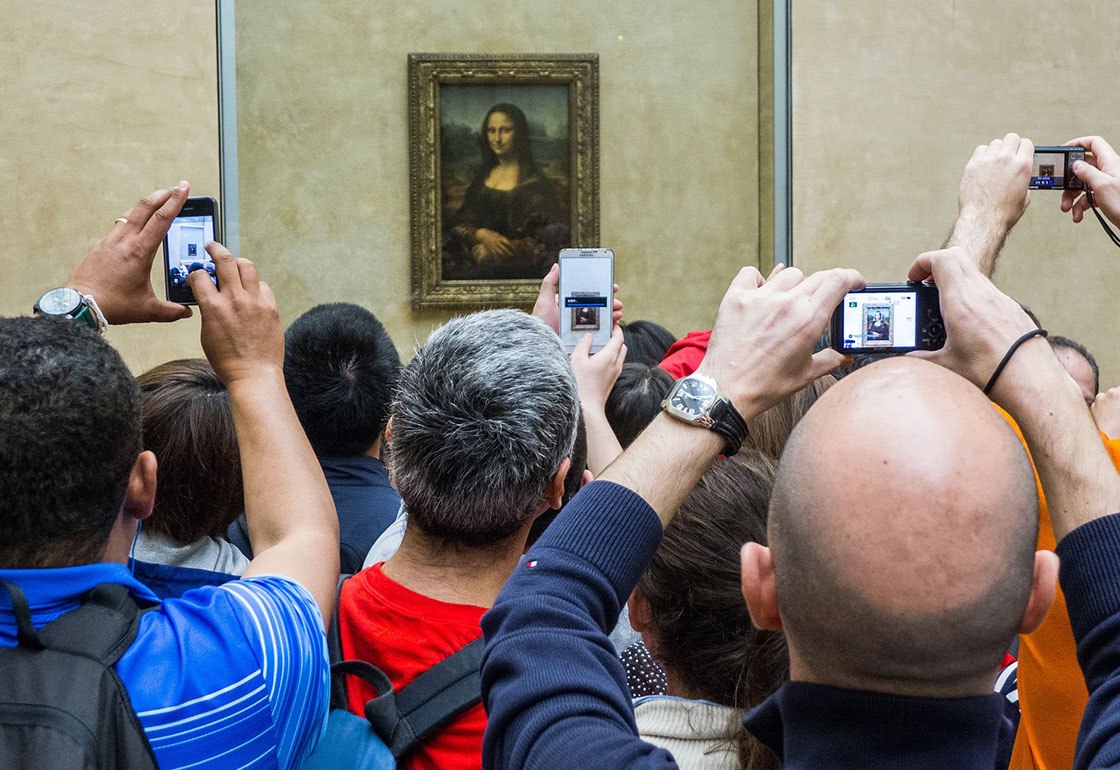
The number of public screens and those with cameras has been growing. The introduction of smartphones and the rise of selfie culture shows that people still want to get their faces into the latest tech. Apps like FaceSwap have become top of the download charts by taking this a step further with bespoke face-tracking technology. But their ubiquity means the novelty of digital technologies has worn off too. We want to engage people in the experiences we design in a way that feels unintrusive, natural, playful, and responds to the level of interaction they want. The Dixon’s Effect has characteristics that help it do this successfully:
1 Attraction
Inviting rather than grabbing attention.
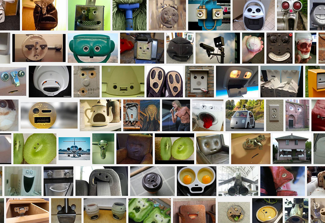
People are naturally drawn to images of faces, even more their own face, a moving image acts as an even greater attractor. Our brains are wired to see facial patterns wherever possible, it’s what leads to seeing ‘Little Fellas’ in plug sockets, toilet bowls, and other inanimate objects. Mirroring our own movements to attract is another classic interaction design tool. The invention of the skyscraper required the lift and, to combat the death-defying height, enclosed space, and mistrust of equipment, mirrors were added as an effective distraction.
2 Interaction
Encouraging rather than forcing interaction.
The installation is always on, always videoing and showing the high street but only when someone walks into frame does it become playful. In this way it’s passive and becomes like a piece of street furniture or a public fountain.
3 Experience
A playful rather than a linear experience.
This means that the user creates their own narrative through the interaction, as opposed to being guided step-by-step. It’s playful potential is the draw and the immediacy with which it reacts to any user that realises they’ve become part of the interactive, holds a spontaneity and creates an opportunity for personal creativity. Whether waving, getting just your head in shot, or mooning the window, the Dixon’s Effect allows for a range of passive and active users.
Application
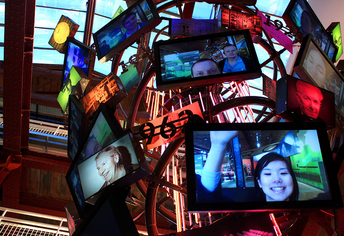
We’ve used The Dixons Effect principles in a number of installations, most notably for our digital chandelier installation at the Museum of Science and Industry in Manchester. This allows visitors to photograph themselves using registration pods at the entrance to the museum and then see their image appear on one of 24 large screens that make up the 30ft high double-helix sculpture, that winds its way up through the 3 storey atrium space. Their ‘museum selfie’ goes from screen to screen up the chandelier and is positioned next to pictures of famous innovators and pioneers from Manchester’s past, to explain to visitors that they too could be the pioneers of the future.
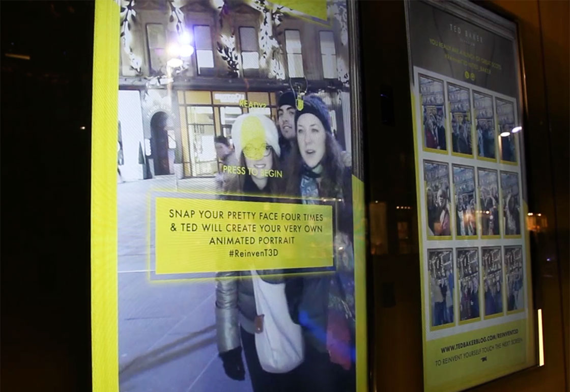
We also created a series of animated portrait makers for Ted Baker stores that made gifs of passersby on the high street. We used face tracking to augment the portrait with props like the crown jewels for the Regent Street store, and for the Amsterdam store we used a live paint effect to make customer’s portraits look like a Van Gogh masterpiece.
We think it’s possible to bring this sort of playful interaction back to our high streets and public spaces. Even though the novelty of technology has worn off, we believe that the digitally jaded can be surprised, intrigued, and engaged by thoughtfully crafted and appropriately designed interactive experiences.
